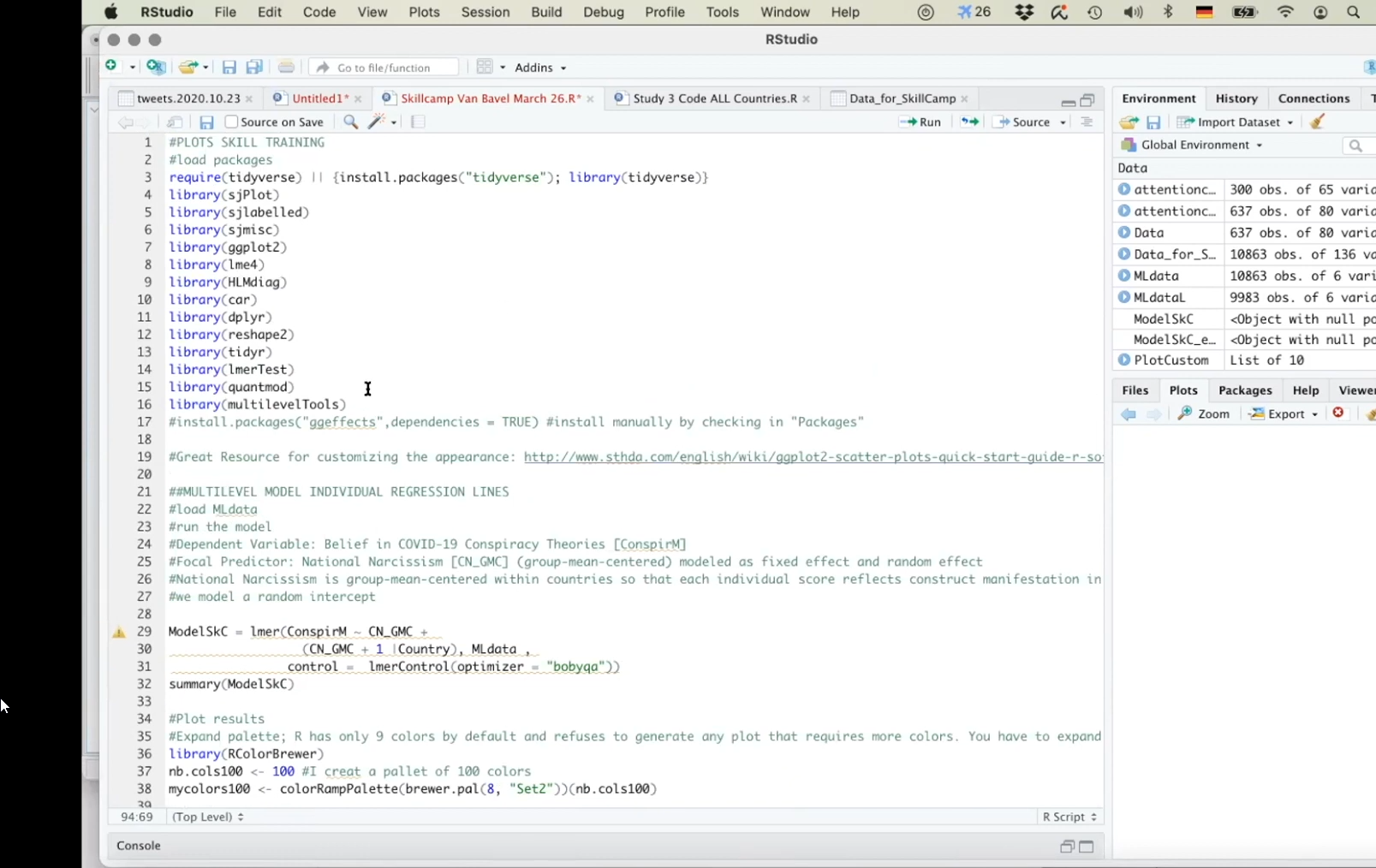
Visualising Linear Mixed Effects Model Python: Linear mixed effects models are powerful statistical tools used in various fields, including psychology, biology, and social sciences, to analyze data that have a hierarchical or nested structure.
Visualizing the results of these models can provide valuable insights into the relationships between variables and help communicate complex findings to a broader audience.
In this article, we will explore different visualization techniques for linear mixed effects models and discuss how they can enhance the interpretation of results.
Understanding Linear Mixed Effects Models
Before diving into visualization techniques, let’s first understand the basics of linear mixed effects models. These models are an extension of traditional linear regression models and are particularly useful when dealing with data that exhibit correlations or dependencies due to the hierarchical structure of the data.
In a linear mixed effects model, there are fixed effects, which represent the overall population-level relationships between variables, and random effects, which account for the variability within groups or clusters in the data.
The model incorporates both fixed and random effects to capture the within-group correlations and between-group variations, making it a powerful tool for analyzing complex data structures.
Visualizing Fixed Effects
One way to visualize the fixed effects in a linear mixed effects model is through coefficient plots. These plots display the estimated coefficients for each predictor variable along with confidence intervals, allowing us to assess the significance and direction of the relationships.
For example, a coefficient plot can show how the response variable changes with the predictor variable while accounting for other variables in the model.
Another useful visualization technique for fixed effects is partial residuals plots. These plots help us examine the relationship between a predictor variable and the response variable while controlling for other variables in the model.
By plotting the residuals against the predictor variable, we can assess the linearity and strength of the relationship.
Visualizing Random Effects
Visualizing random effects in a linear mixed effects model can provide insights into the variability within groups or clusters in the data. One common approach is to use dot plots or violin plots to display the distribution of random effects for each group.
These plots can reveal patterns of variation among groups and help identify potential outliers or influential groups.
Another useful visualization technique for random effects is the variance component plot. This plot shows the estimated variance components for the random effects in the model, allowing us to quantify the amount of variation attributed to each random effect.
Understanding the relative contributions of different random effects can help us better interpret the results of the model.
Visualizing Model Diagnostics
In addition to visualizing the fixed and random effects, it is essential to assess the validity of the linear mixed effects model through diagnostic plots.
Residual plots, QQ plots, and leverage plots are commonly used to check the assumptions of the model, such as normality of residuals, homoscedasticity, and influential data points.
Furthermore, we can use marginal and conditional R-squared values to evaluate the goodness of fit of the model. These metrics provide insights into how well the model explains the variability in the data at the population level and within groups, respectively.
Visualizing the distribution of residuals and the model fit can help us identify potential issues and improve the model’s performance.
Interactive Visualizations
Interactive visualizations can enhance the exploration and interpretation of linear mixed effects models by allowing users to interact with the data dynamically.
Tools like Shiny apps or interactive plots created with packages like Plotly or ggplot2 can provide a more engaging way to explore the model results and investigate different scenarios.
For example, an interactive coefficient plot can allow users to toggle between different predictor variables, adjust the confidence level, or explore the model predictions for specific groups or clusters.
Interactive visualizations can make complex statistical models more accessible and facilitate communication with a broader audience.
Conclusion
Visualizing linear mixed effects models is essential for gaining insights into the relationships and patterns in complex data structures.
By utilizing a variety of visualization techniques for fixed effects, random effects, and model diagnostics, we can enhance the interpretation of model results and communicate findings effectively.
Whether through coefficient plots, random effects distributions, or interactive visualizations, visualizing linear mixed effects models can help researchers, practitioners, and decision-makers make informed decisions based on the analysis of hierarchical data.
By combining statistical expertise with effective data visualization, we can unlock the full potential of linear mixed effects models and extract meaningful insights from diverse datasets.


